In this blog series we’ll be experimenting with the most interesting blends of data and tools. Whether it’s mixing traditional sources with modern data lakes, open-source devops on the cloud with protected internal legacy tools, SQL with noSQL, web-wisdom-of-the-crowd with in-house handwritten notes, or IoT sensor data with idle chatting, we’re curious to find out: will they blend? Want to find out what happens when IBM Watson meets Google News, Hadoop Hive meets Excel, R meets Python, or MS Word meets MongoDB?
Today: Google BigQuery meets SQLite. The Business of Baseball Games
Author: Dorottya Kiss, EPAM

The Challenge
They say if you want to know American society, first you have to learn baseball. As reported in a New York Times article, America had baseball even in times of war and depression, and it still reflects American society. Whether it is playing, watching, or betting on the games, baseball is in some way always connected to the lives of Americans.
According to Accuweather, different weather conditions play a significant role in determining the outcome of a baseball game. Air temperature influences the trajectory of the baseball; air density has an impact on the distance covered by the ball; temperature influences the pitcher’s grip; cloud coverage affects the visibility of the ball; and wind conditions - and weather in general - have various degrees of influence on the physical wellbeing of the players.
Another interesting article on Crowdhitter describes the fans’ attendance of the games and how this affects the home team’s success. Fan attendance at baseball games is indeed a key factor, in terms of both emotional and monetary support. So, what are the key factors determining attendance? On a pleasant day are they more likely to show up in the evening or during the day, or does it all just depend on the opposing team?
Some time ago we downloaded the data about attendance at baseball games for the 2016 season from Google’s Big Query Public data set and stored them on our own Google Big Query database. For the purpose of this blending experiment we also downloaded data about the weather during games from Weather Underground and stored these data on a SQLite database.
The goal of this blending experiment is to merge attendance data at baseball games from Google Big Query with weather data from SQLite. Since we have only data about one baseball season, it will be hard to train a model for reliable predictions of attendance. However, we have enough data for a multivariate visualization of the various factors influencing attendance.
Topic. Multivariate visual investigation of weather influence on attendance of baseball games.
Challenge. Blend attendance data from Google BigQuery and weather data from SQLite.
Access Mode. Database Connector node with Simba 4.2 JDBC driver compatible with access to Google Big Query and dedicated SQLite Connector node.
The Experiment
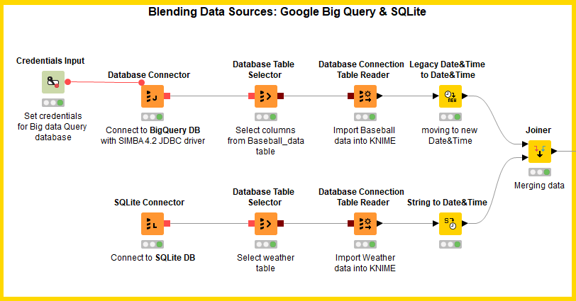
The first part of the workflow connects with the two data storage platforms: Google Big Query and SQLite.
KNIME Analytics Platform provides dedicated and generic nodes for database access. Using a generic node instead of a dedicated node does not change the database access performance. It just requires a few additional configuration settings that are not required in a dedicated node.
The Database/Connectors category in the Node Repository offers a dedicated connector for SQLite, but not a dedicated connector for Big Query, at least not yet. We will then use the dedicated SQLite Connector node to access SQLite and a generic Database Connector with the appropriate JDBC driver to connect to Google Big Query.

1. Connect to Google Big Query
To connect to Google Big Query, we downloaded the free Simba 4.2 compatible JDBC driver from the Google Cloud Platform (https://cloud.google.com/bigquery/partners/simba-drivers/).
The Simba 4.2 driver was then uploaded into KNIME Analytics Platform under: File → Preferences → KNIME → Databases through the “Add directory” button.
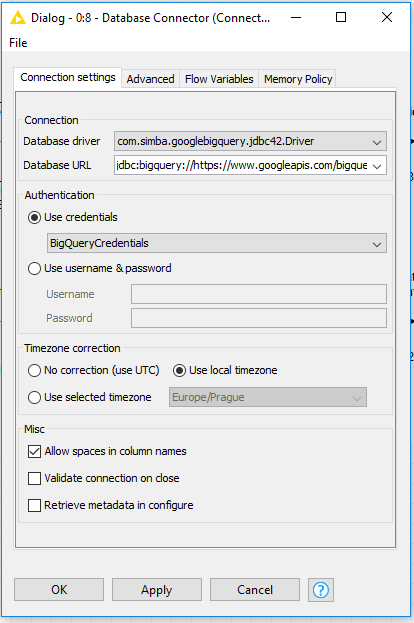
Then in a new workflow, we created a generic Database Connector node. Since the Simba compatible driver has already been uploaded, it now appears in the list of available database drivers for the setting “Database driver” in the node configuration window.
Besides the database JDBC driver, the Database Connector node also requires the database URL, the credentials, and a number of other database related settings (Fig. 2).

Note. Each database URL requires the appropriate protocol. For Google Big Query this is jdbc:bigquery://
Credentials can be supplied directly as username and password or via a Credentials Input node. This last option is recommended, since it provides default credential encryption and therefore it is more secure.
After that, a Database Table Selector node points to the baseball game attendance table according to a quite simple SQL query.
Finally, a Database Connection Table Reader node imports the data into KNIME Analytics Platform, where we now have the attendance data for all baseball games in the US from 2016-04-03 to 2016-10-02.
The full node sequence can be seen in the upper branch in figure 1.
2. Connect to SQLite
Now we need to import the weather data which are stored in a SQLite database.
It might seem surprising, but the steps required to access an SQLite database are exactly the same as the steps required to access the Google Big Query database (see lower branch in Fig. 1). Unlike Google Big Query, SQLite enjoys the privilege of a dedicated connector node, in which the driver file is embedded.
In the same workflow, we created a SQLite Connector node, where we provided the path of the SQLite file.
After that, a Database Table Selector node points to the Weather table according to a quite simple SQL query:
Finally, a Database Connection Table Reader node imports the data into KNIME Analytics Platform, where we now have the weather data for all baseball games in the US from 2016-04-03 to 2016-10-02.
Note. If you are lost as to which table to select in the configuration window of the Table Selector node, the Fetch Metadata button in the top left corner can come to the rescue. Indeed, the Fetch Metadata button allows you to explore the database content.
3. Blending Baseball and Weather data
Both datasets contain date type fields. Dates have been stored as Strings in SQLite and as DateTime objects in Google Big Query.
Note. With the latest version of KNIME Analytics Platform 3.4, new more flexible date and time column types have been introduced, representing just date, just time, or date&time, possibly with the associated time zone information.
However, for now, the DateTime fields in a database are imported into KNIME Analytics Platform using the old legacy DateTime column type. Therefore, after the data extraction, we need to convert such dates to the more recent Date&Time column type.
The “Legacy Date&Time To Date&Time” node converts the DateTime objects imported from Google Big Query into the new KNIME Date&Time type. The “String To Date&Time” node performs a similar conversion for the dates imported from SQLite.
Game attendance and weather data are joined together on the game date with a simple Joiner node using the inner join function. The full workflow is shown in figure 3.

Inside the Pre-Processing metanode, the temperature difference between temp_high and temp_low is calculated. There the game time segment is also extracted, meaning afternoon, evening, or night. Such time segments are created using the hour information. Since all times in the database are expressed in UTC, the appropriate time zone has been assigned to each city, and the Date&Time objects have been shifted accordingly to express the local time using two Modify Time Zone nodes.
4. Data Visualization
First question: which team fills their stadiums most of the time? I am sure you have a guess, but let’s compare attendance numbers and stadium capacity.
In the metanode named AttendanceGap we calculate:
- the average attendance by HomeTeamName,
- the stadium fulfillment ratio (named AttendanceGap) as:
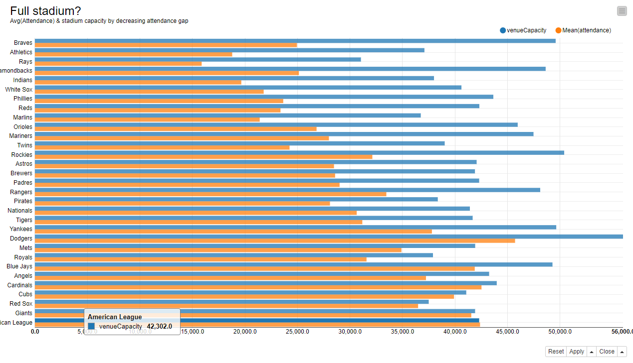
Average attendance and stadium capacity are then sorted by decreasing AttendanceGap and represented side by side in a bar chart (Fig. 4) with a Javascript Bar Chart node.
Now to the second set of questions. Does weather influence game attendance? If yes, which weather conditions have the highest impact?
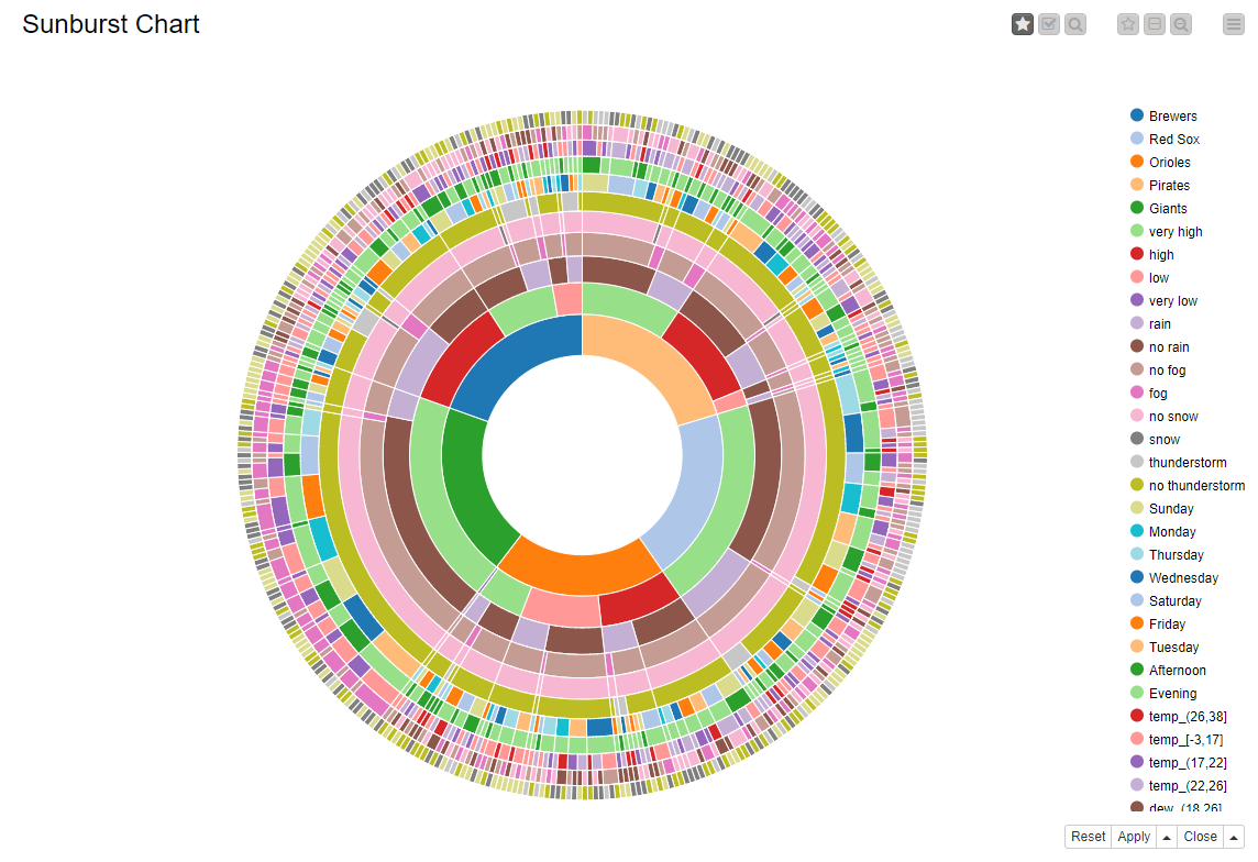
In order to visualize all these factors, we use a sunburst chart. Sunburst charts though do not represent numerical values, however, just ranges or nominal values. So, here we need to prepare the data accordingly.
In the metanode named “Binning”, a Missing Value, an Auto-Binner, a Rule Engine, and a String Manipulation node transform our numerical data into quantile intervals and our binary data, like Rain =0/1, into String values, like “Rain”/”no Rain”. In particular, the Rule Engine node groups the games in ‘Low’, ‘Medium Low’, ‘Medium High’ and ‘High’ attendance categories and the Math Formula node calculates the game attendance ratio as attendance/stadium capacity.
In order to make the final chart easier to inspect, we concentrate on only 5 home teams: Orioles, Pirates, Giants, Red Sox, and Brewers. The Javascript Sunburst Chart node ends this branch of the workflow.
The Results
The bar chart shows the average attendance and the stadium capacity for each one of the home teams, sorted by attendance gap ratio.

It looks as if only the American League, the Giants, the Red Sox, the Cubs, and the Cardinals can count on a large number of committed fans to fill their stadiums on a regular basis.
On the opposite the Braves, the Athletics, the Rays, and the Diamondbacks seemed to lack some support from their fans in the 2016 season.
Let’s have a look now at the sunburst chart. The chart is organized in a number of concentric circles, each circle covering the value of a given input feature. In figure 5 we see the home teams in the most internal circle, then the attendance level, then rain, fog, snow, and thunderstorm presence or absence, the days of the week, the time segments, and finally the temperature, dew, and humidity intervals.
The sunburst chart allows for focus and selection modes. In focus mode, you can just mouse over and explore the size of the different subsets in the dataset.
For example, in perfect weather conditions (no rain, no snow, no thunderstorm, no fog), we have a very high attendance for the Red Sox. This segment accounts for almost 13% of the records in the dataset. If you inspect the chart further in focus mode, however, you discover that the Red Sox always have very high attendance, no matter what the weather conditions are.
If we continue our exploration, we see that the Orioles have had games with low attendance. However, here it does not look as if the weather conditions are predominantly different from the highly attended games. From a calendar point of view, though, Orioles games on Wednesday evenings suffer the most from lack of participation.
Brewers’ games in adverse weather conditions, such as rain or thunderstorm, were not as well attended as other games in better weather conditions.

If we take the time to explore it, the sunburst chart exposes a large amount of information organized across the selected input features, potentially showing unsuspected co-occurrences.
The workflow used for this blog post is available as usual on the KNIME EXAMPLES server under: 01_Data_Access/02_Databases/10_GoogleBigQuery_meets_SQLite01_Data_Access/02_Databases/10_GoogleBigQuery_meets_SQLite*
Coming Next...
If you enjoyed this, please share it generously and let us know your ideas for future blends.
We’re looking forward to the next challenge. There we will tackle the blending of a Spark SQL query with a Hive SQL query. Will they blend?
