We at KNIME traditionally schedule releases twice a year – in summer and winter. The winter release is always on December 6. But why? In Germany, December 6 is St. Nicholas Day. On the night before, children put a shoe outside their bedroom doors. When they wake up in the morning they find their shoes filled with small gifts from St. Nicholas – aka Father Christmas. Legend has it that St. Nicholas enjoyed surprising people with presents. We like this particular tradition and it’s why we fill the KNIME community’s shoes with the latest version of our software on December 6.
We would now like to present this blog article on our “New Design” which is all part of the St. Nicholas Day release, KNIME Analytics Platform v3.1.
Modern Design
This 3.1 release is most visibly marked by the new design and layout of the user interface. We wanted a design concept that would maximize clarity and legibility. The crispness and simplicity of flat design meets these requirements.
The designer who transformed our ideas into this clear and appealing design, Lydia Krüger, Creative Designer (B.A.) said “The new design is simple and minimalistic – reduced to the essence. The focus is clearly on the functions of the individual components. Particularly when faced with such complex structures, simplicity is important. And: good design is like a good friend – it doesn’t attempt to impose but brings out the best in you.”
Welcome Page and Node Descriptions
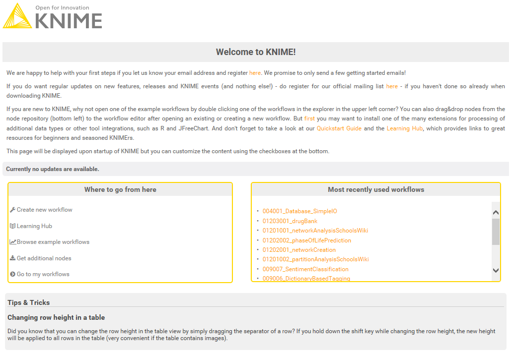
When you start KNIME Analytics Platform 3.1 for the first time the most obvious change is the new welcome page. The layout and style has been adapted to suit the style of the KNIME website. The functionality of the welcome page hasn’t changed: you can still quickly create new workflows, install additional extensions, or navigate to the learning hub or the example server. Tips & Tricks are presented at the bottom of the page.
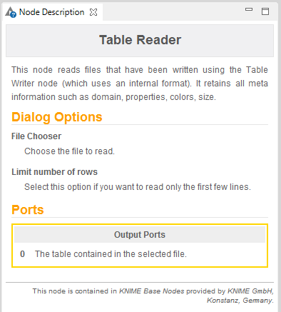
The style of the node descriptions has been changed too, however the content itself has not. It shows the description of the node and its functionality, as well as the description of the configuration parameters, and input and outs ports.
Nodes
When you open an existing workflow or create a new one, you will see that the layout of the nodes, traffic lights and much more has been redesigned.
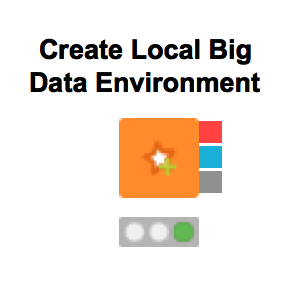
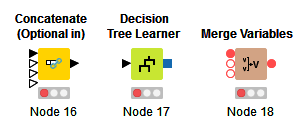
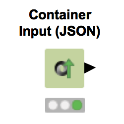
The background of the nodes has been changed from an old, curved 3D look, to a new flat, tile look. Along with that, the node background, the node icons, the traffic lights, the warning and error symbols, as well as the font style of the node names and annotations have been changed. The whole new design is all flat and modern.


The mandatory input and output ports of the nodes are now filled, optional input ports are not filled.
New flat icons are also used in the context menus, e.g. the node context menu, see below.

Node Repository
The clear flat design of the nodes can be seen well in the Node Repository window. And the clarity and functionality of our new design is also supported by new functionality. The Node Repository window now includes a fuzzy search function. This makes retrieval of nodes much quicker and easier. See the upcoming blog article on the functionality and new nodes in KNIME Analytics Platform v3.1 for more detailed information.
This article is part of a three-part series about our KNIME 3.0-3.1 release. Part 1 was dedicated to the internal changes to the underlying architecture and API.
