How would your favorite restaurant perform in a health inspection? Are you sure you are eating in one of the most reliable and safest restaurants in town? If you live in Austin, Texas, we can check.
Over the last three calendar years, data.austintexas.gov has published a dataset of restaurant inspection scores for Austin (TX) restaurants. Inspection scores range between 0 (theoretically) and 100. An inspection score lower than 70 requires corrective measures; repeated low scores may even necessitate the closure of the restaurant.
We will use this dataset to visually explore:
- How many restaurants have been inspected in each ZIP code area;
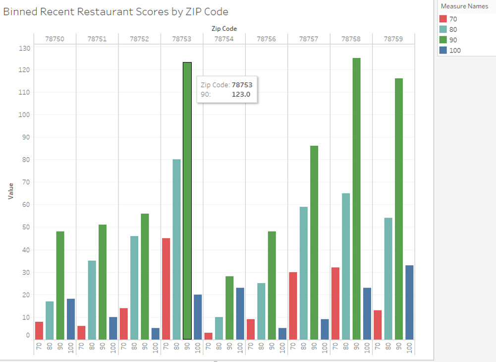
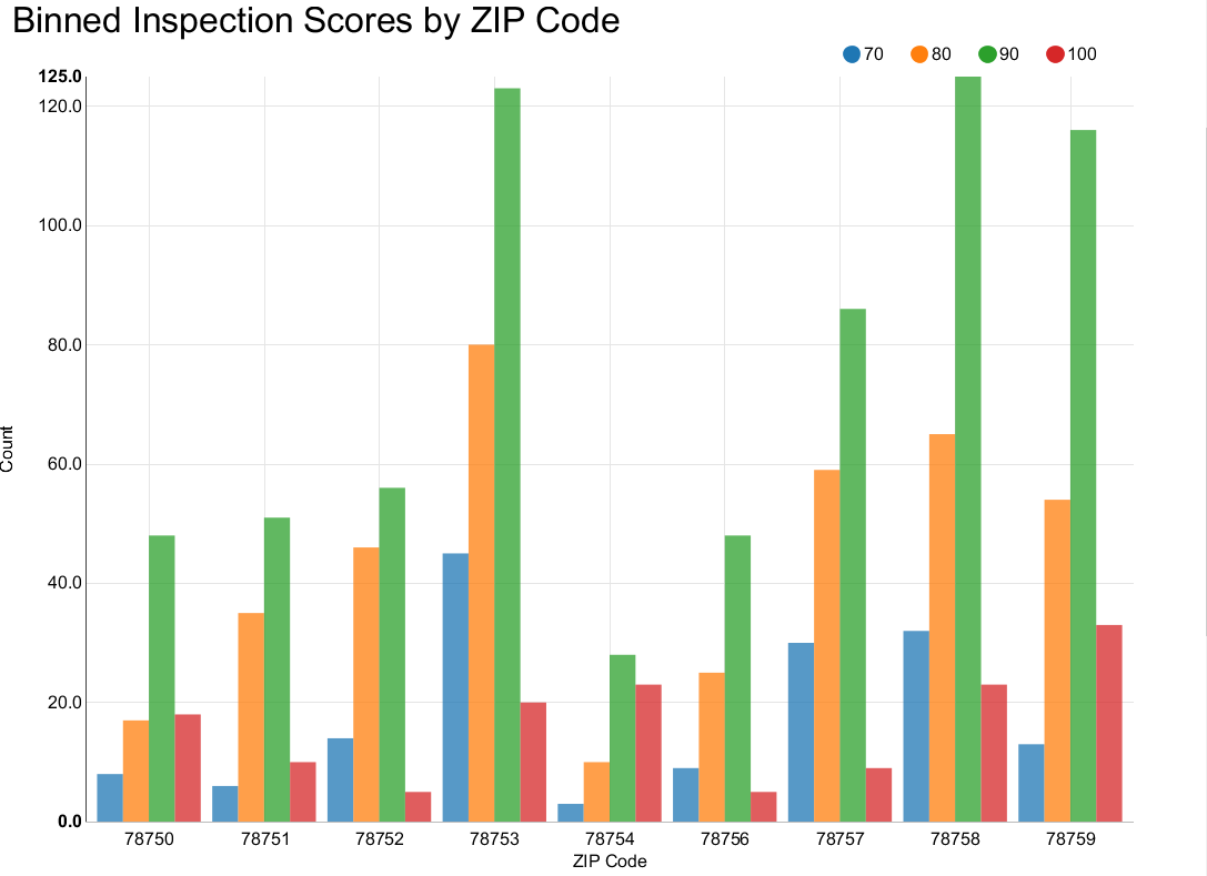
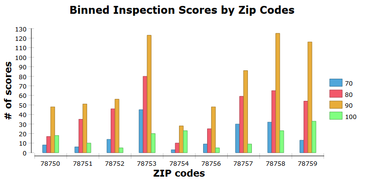
- Of those restaurants how many have scored between 70 and 80, 80 and 90, and 90 and 100, as well as perfect 100 scores;
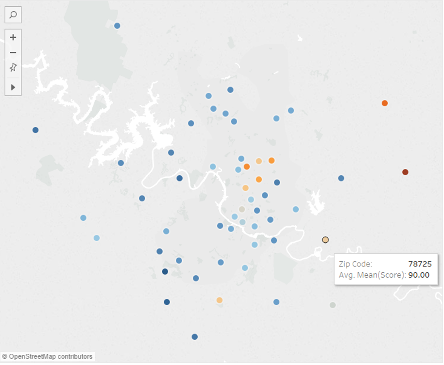
- And finally, the average scores for ZIP code locations in the Austin area.
For each one of these goals we will use a:
- pie chart;
- grouped bar chart;
- geolocation map.
So far so good. Now we need to choose the graphical tool for such representations.
Since data manipulation within a reporting environment might be clunky, many KNIME users prefer to run the data manipulation comfortably from KNIME Analytics Platform, and later export the data to their preferred reporting tool.
There are many ways to produce graphics in a report with KNIME Analytics Platform. Today we will consider three: with native graphics in BIRT, with JavaScript based images exported to BIRT, with native graphics in Tableau.
BIRT (Business Intelligence Reporting Tool) is a reporting tool, which to a certain extent, is distributed as an open source tool. The KNIME Report Designer extension integrates BIRT within KNIME Analytics Platform. The “Open Report” button in the KNIME tool bar takes you to the BIRT report environment. The “KNIME” button in the BIRT report environment takes you back to the KNIME workbench.
Tableau Desktop is a reporting tool, which requires a commercial license. 14-day trial licenses are also available at the Tableau Desktop site. The KNIME Tableau extension allows you to communicate with Tableau Desktop via TDE files or directly with the Tableau Server.
It is also possible to produce the graphic image in the KNIME workflow via the JavaScript nodes and subsequently export the image to the reporting tool of your choice.
In today’s Will They Blend, we want to highlight the process of generating a few simple graphics using BIRT, JavaScript, and Tableau. Can we produce three simple charts using those tools? What might that involve? Let’s find out!
Topic. Data Visualization using BIRT, Tableau, and JavaScript
Challenge. Create a Pie Chart, a Bar Chart, and a geo-location map using BIRT, Tableau, and JavaScript
Access Mode. KNIME Tableau extension, Report Designer extension, JavaScript Views extension, Open Street Map Integration extension
The Experiment
For this particular experiment we need the following KNIME extensions:
- Tableau extension,
- Report Designer extension,
- JavaScript Views extension,
- Open Street Map Integration extension
We also need a licensed installation of Tableau Desktop.
We first pre-process the data in KNIME to obtain only the most recent inspection score for each restaurant.
Next, we produce three different plots, in order of complexity:
- A simple pie chart of number of inspections by ZIP Code in North Central Austin
- A grouped bar chart showing binned restaurant scores by ZIP code in North Central Austin
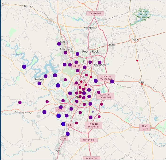
- A symbol map of average scores by ZIP code for the entire Austin area
In the following, we will discuss how to prepare the data for visualization using data manipulation nodes inside a KNIME workflow. Then we will describe how the data are exported to build the plots in BIRT, Tableau, and JavaScript.
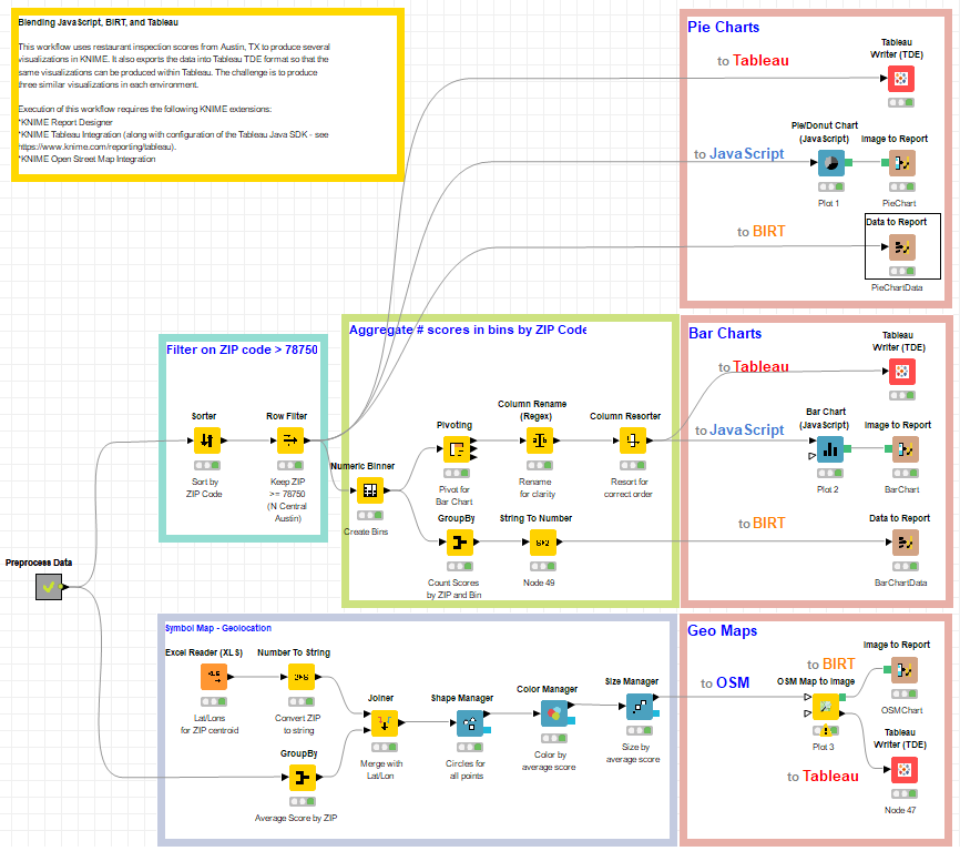
The workflow used is shown below, and is available on the EXAMPLES server under:
05_Reporting/02_Tableau/02_Tableau_BIRT_JS05_Reporting/02_Tableau/02_Tableau_BIRT_JS*
Figure 1. The workflow for this blend processes restaurant inspection scores to produce three different charts, in BIRT, Tableau, and JavaScript. This workflow is available on the KNIME EXAMPLES server under 05_Reporting/02_Tableau/02_Tableau_BIRT_JS05_Reporting/02_Tableau/02_Tableau_BIRT_JS*
KNIME for Data Preparation
As shown above, the pre-processed data are passed out of a metanode along a few different paths.
- The first path, shown in the area outlined in aqua above, is for restricting analyses to a subset of ZIP codes in the North Central Austin area.
- For the grouped bar chart, additional processing was performed using the KNIME nodes in the area outlined in green. First, bins for the score data were created using the Numeric Binner node. Inside this path, two sub-paths are started to count the scores for each bin:
- with a GroupBy node to prepare data for a BIRT bar chart
- with a Pivoting node to prepare data for a JavaScript based bar chart and for a bar chart in Tableau.
- Finally, the last branch of the workflow creates the symbol map using the nodes shown in the area of the KNIME workflow outlined in light blue. First, average scores for each ZIP code were calculated using a GroupBy node. A table of latitude and longitude values for the centroid of each ZIP were read in using the Excel Reader (XLS) node, and the ZIPs were converted to strings with a Number to String node.
We are ready to plot.
Pie Charts
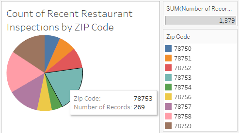
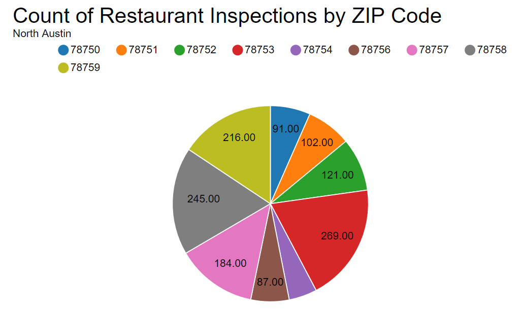
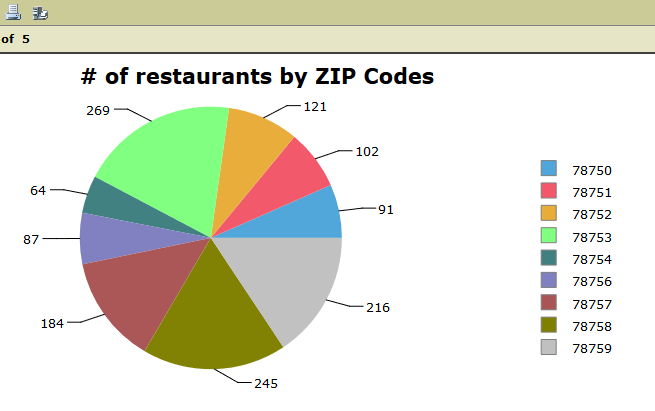
The upper right light red square contains 3 simple strategies to plot the input data to a pie chart. We want the pie chart to show the number of restaurants per ZIP code. Thus, the input data are produced by the first Row Filter node.
- To Tableau. The node named “Tableau Writer (TDE)” generates a Tableau Data Export (TDE) file of the input data. Double clicking the exported TDE file brings up the Tableau interface, with our data preloaded. Inside the Tableau platform, “ZIP code” was selected as the dimension, and “SUM(Number of Records)” as the measure. In the “Show Me” tab, we selected Pie Chart, and in the “Marks” shelf, we assigned “ZIP code” to “Color” and “SUM(Number of Records)” to “Size” and “Angle”.
- To JavaScript. Here the PieDonut Chart (JavaScript) node plots the pie chart of number of restaurants inspections by ZIP code. This node, like all JavaScript View nodes, produces an interactive view and a static image, assuming this has been set in its configuration window. In order to produce a report, the image of the pie chart is sent to an Image to Report node to be exported into the BIRT reporting environment.
- To BIRT. The Data to Report node exports the input data into the BIRT reporting environment. Here, a chart is built using “ZIP code” as row category, with “Grouping” enabled and function “Count”, and using “Score” as slice size definition in the “Select Data” tab.
Bar Charts
A similar approach was adopted to generate the bar charts.
- The Tableau Writer (TDE) node to export the bar chart data into a TDE Tableau formatted file. Inside Tableau, we selected SUM(70), SUM(80), SUM(90), and SUM(100) as our measures and placed them on the Rows Similarly, we used “ZIP code” as a dimension and placed it on the Columns shelf. We selected Side-by-side Bars from the “Show Me” tab. We applied “Measure Names” to Color in the Marks shelf.
- The Bar Chart (JavaScript) node to plot the number of scores in each bin into a bar chart image, and an Image to Report node to include the image into a BIRT report.
- The Data to Report node to export the bar chart data into the BIRT reporting environment. Here, a chart is built using “ZIP code” as “Category (X) Series” with Grouping enabled and function “Sum” and “Count(Score)” as “Category (Y) Series” in the “Select Data” tab.
Notice that while the Pivoting node is preparing the data for the bar chart in Tableau and JavaScript, the GroupBy node produces the bar chart data in the right format to be used by BIRT.
Geo-location Map
For the geo-location map we calculated the average score for each ZIP code area with a GroupBy node. After combining the averages scores with the lat/lons using a Joiner node, a series of Manager nodes set the shape, color, and size of the ZIP code center points.
Finally, a symbol map is generated using the “OSM Map to Image” node, and passed to BIRT with an “Image to Report” node as in the previous steps.
The same ZIP code center points are passed to the Tableau Writer (TDE) node. The TDE file produced by this node is then imported into Tableau. We selected Symbol Map from the “Show me” tab. In the “Marks” shelf, with a mark type Circle, with AVG(Score) to Color and ZIP Code to Detail. We also changed the color palette to “Orange-Blue Diverging” in order to see distinctions among the scores a bit better.
Notice that for this plot, there is no purely BIRT based solution, since the open source BIRT version does not offer a geo-location map. The remaining two solutions - with Tableau and with a JavaScript generated image exported to BIRT – are shown in the figures below.
The Results
As you can see, we set out to build pie charts presenting the number of restaurant inspections for each ZIP code.
We also produced a grouped bar chart showing binned restaurant scores by ZIP code.
Finally, we produced a geolocation map, showing average scores for each ZIP code according to their location coordinates.
The data were processed, blended, joined, cleaned, and colored using KNIME native nodes. The pie chart, bar chart, and geo map were generated with JavaScript, BIRT, and Tableau.
Thus, in conclusion, we can say once again “yes - they blend!”
Of course, there are many more visualization options available in each platform. Experiment on your own and see what you can come up with!
Coming Next …
In this blog series we’ll be experimenting with the most interesting blends of data and tools. Whether it’s mixing traditional sources with modern data lakes, open-source devops on the cloud with protected internal legacy tools, SQL with noSQL, web-wisdom-of-the-crowd with in-house handwritten notes, or IoT sensor data with idle chatting, we’re curious to find out: will they blend? Want to find out what happens when IBM Watson meets Google News, Hadoop Hive meets Excel, R meets Python, or MS Word meets MongoDB?
Follow us here and send us your ideas for the next data blending challenge you’d like to see at willtheyblend@knime.com.
We’re looking forward to the next blending challenge.
* The link will open the workflow directly in KNIME Analytics Platform (requirements: Windows; KNIME Analytics Platform must be installed with the Installer version 3.2.0 or higher)
