
KNIME and Python, together combine the best of visual programming with scripting. You can seamlessly visualize your data with the integration of Python libraries into KNIME.
The KNIME Python Integration extension serves as a bridge between the two platforms, making it easier to access a plethora of powerful Python-based visualization libraries – including Matplotlib, Seaborn, Plotly, and Vega-Altair. At the heart of this connection lies the Python View node, which enables you to create visualizations in the form of PNG, SVG, JPEG, or standalone HTML documents.
In this blog post, we will walk through the Python-based visualizations in KNIME. We will discuss:
- How to install the KNIME Python Integration
- How to create static and interactive visualizations in KNIME
How to install the Python Integration extension
1. Download the KNIME Python Integration extension
- To start immediately, you can download the KNIME Python Integration extension from the KNIME Hub and install it.
- Option 1: Drag and drop the extension KNIME Python Integration from the KNIME Hub into the workbench. It will begin to install automatically.
- Option 2: Install it manually via File → Install KNIME Extensions → Select the KNIME Python Integration extensions → Click Next and follow the instructions → Restart KNIME Analytics Platform.
- Once installed, you can use the Python nodes in KNIME.
2. Bundled Python environment
- This extension contains a bundled Python environment consisting of a set of Python libraries. The bundled environment includes a specific set of Python packages (i.e., Python libraries) ready for immediate use.
- You can use the Python Script node and start scripting using any library included in the bundled environment. The Python Script node allows you to write Python code directly within KNIME.
3. Python visualization libraries:
- Within the bundled Python environment, there are three popular visualization libraries available:
- Matplotlib
- Seaborn
- Plotly
- These libraries allow you to create various types of visualizations directly within KNIME.
- After creating your visualizations using one of these libraries, you can view them using the Python View node.
4. Using custom Python environments
- If you need to use a visualization library that is not available in the bundled environment, you can use the Conda Environment Propagation node.
- This node allows you to select a custom environment that contains the specific Python library you need.
- Once installed, you can select the environment in which they are installed using the Conda Environment Propagation node.
Note: Libraries like Vega-Altair or GGplot are not available in the bundled environment, you can install them separately in your local Python environment.
Read more about managing Python environments with Conda and KNIME.
Once you’ve installed the integration, you’re ready to start creating Python-based visualizations in KNIME.
Static or interactive visualization in KNIME
You can create static or interactive visualizations with the Python View node.
Let’s break it down into three simple steps:
How to create a static visualization with the Python View node
Static Visualizations are typically used for simple visualizations to highlight key insights. For example, a bar chart with year-on-year trends or a scatter plot showing sales distributions. You cannot interact with these static visualizations or change any of the chart attributes, such as axes or units. They produce PNG, SVG, JPEG images, or HTML documents. Static visualizations are helpful if you need to export content for other uses, such as including them in reports, and presentations.
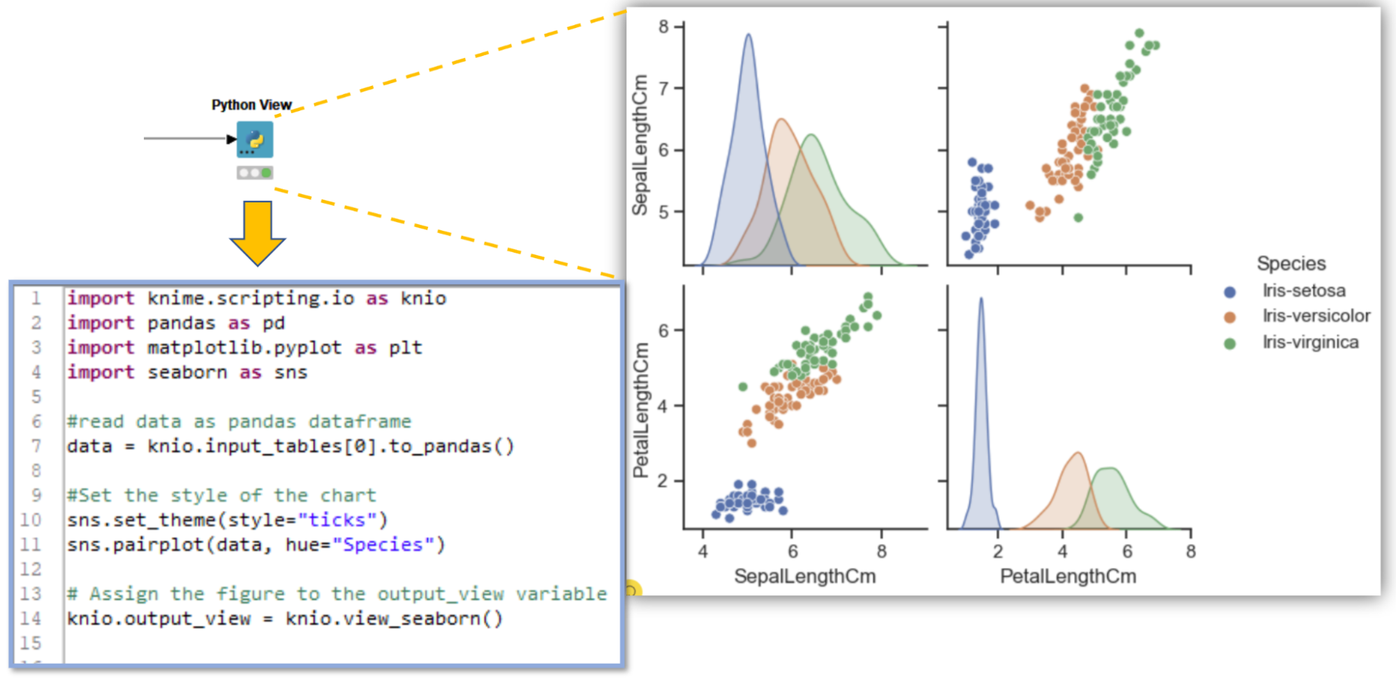
You can create static visualizations using any Python library, but we’ll show you a simple example of how to create a pair plot with the Seaborn library. We'll visualize pair plots for the Iris flower dataset. These pair plots display the distribution of iris flower species across various features.
Step 1: Import the required libraries and read the data
Using the Python View node, we import “knime.scripting.io” as the main contact point between KNIME and Python, and the “Seaborn” library for visualization. Then read the input data as a pandas dataframe.
# Import required python library
import knime.scripting.io as knio
import seaborn as sns
# Read input data as pandas dataframedata = knio.input_tables[0].to_pandas()
Step 2: Create plots and assign output for visualization
Create the pair plot with Seaborn as a Python object. This object is assigned the node’s output view using the command: knio.view_seaborn()
# Use the seaborn library for visualization
sns.set_theme(style="ticks")
sns.pairplot(data, hue="Species")
# Assign the figure to the output_view variable
knio.output_view = knio.view_seaborn()
Step 3: Execute to view static visualization
Insert the above code inside the Python View node, right-click the node, and select the option “Execute and Open Views”. This will execute the node and launch the node view as shown below.
The Python View node also provides special view implementations. For example, if you are using the seaborn library, assign the return value of knio.view_seaborn(), and with the matplotlib library, assign the return value of knio.view_matplotlib() to the node’s output view.
You can find more info in KNIME Python API documentation of Views
How to create Interactive Python-based visualizations
Interactive visualizations enhance analysis by allowing you to interact with the data. They also share the same “interactivity” properties as native KNIME View nodes. For example, you can select a specific region or time range in the first visualization, and this selection is applied to other sets of visualizations. This will help you dive deeper into the analysis and determine interesting features. Interactive visualizations are an easy way to explore and understand analyses that are based on rapidly changing data.
The Plotly Python library is an interactive, open-source plotting library that supports over 40 unique chart types covering a wide range of statistical, financial, geographic, scientific, and 3-dimensional use cases.
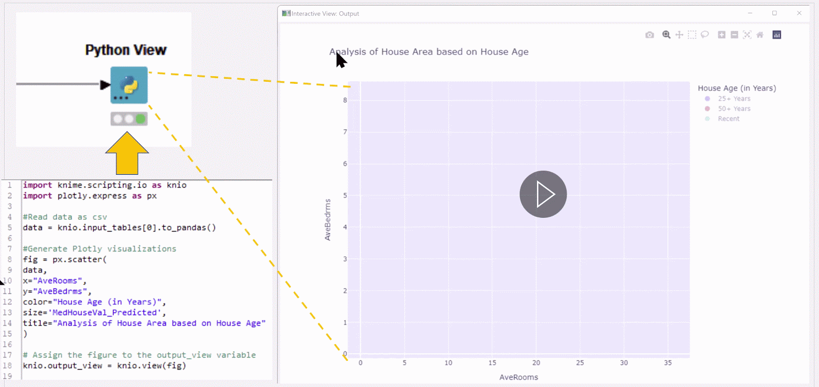
In this example, we will use this library to generate an interactive scatter plot of houses, based on a housing dataset. It will visualize the houses by average rooms and average bedrooms and the user will be able to select a time range, by house age.
Step 1: Import the required libraries and read the data
Using the Python View node, we import “knime.scripting.io” as the main contact point between KNIME and Python, and the “Plotly” library for visualization. Then read the input data as a pandas dataframe.
import knime.scripting.io as knio
import plotly.express as px
# Read data as pandas dataframe
data = knio.input_tables[0].to_pandas()
Step 2: Create a plot and assign output for visualization
We create a scatter plot and then assign the Plotly visualization to the node’s output view using the command: knio.view(fig).
fig = px.scatter(
data,
x="AveRooms",
y="AveBedrms",
color="House Age (in Years)",
size='MedHouseVal_Predicted',
title="Analysis of House Area based on House Age"
)
# Assign the figure to the output_view variable
knio.output_view = knio.view(fig)
Step 3: Execute to view interactive visualization
Insert the above code inside the Python View node, right-click the node, and select the option “Execute and Open Views”. This will execute the node and launch the node view as shown In the figure below:
The scatter plot shows data points that reflect the range – the “house age” – selected by the user in the legend panel (on the right) of the scatter plot.
After creating your visualization, you can further analyze the data, make comparisons, and draw conclusions. For instance, you can identify trends, outliers, or correlations within your data. Additionally, you can integrate your visualization into reports, and presentations, or share it to communicate your findings effectively.
Gain the flexibility to work with the tools you love
The ability to leverage your favorite Python-based visualizations through the KNIME-Python Integration reinforces our commitment to providing an open system.
With integrations to all the relevant tools and environments within the KNIME ecosystem, you have the flexibility to take the best of the different tools and libraries you love and bring it all together in KNIME.
Explore more Python resources
- Python Script Space contains simple workflows to get you started with KNIME Python Integration.
- A few examples of using Python View node can be found at Python view Examples.
- Check the KNIME Workflow Visualise with Python View using Matplotlib and Seaborn package on generating static visualizations.
- Check the KNIME Workflow Interactive Scatter Plot Visualisation with Python View node using Plotly package for using Plotly with KNIME.
- Check the Sharing Component with Interactive Visualisation using Python View node with Plotly package for building a KNIME Component with Python View node.
To learn more about running Python scripts from the KNIME Analytics Platform, explore the KNIME Blog How to Set Up Your Python Extensions