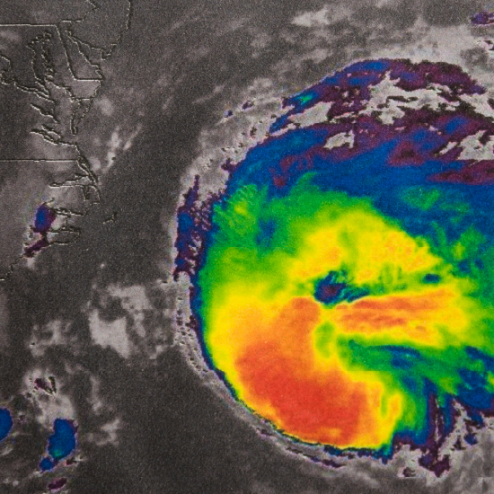
News is spread on social media within seconds of it happening. In the days before and after Hurricane Ian made landfall in southwestern Florida, Twitter flooded with twenty-one million tweets about the crisis.
Social media has become an integral part of crisis management, with real-time information enabling emergency responders to stay informed and make timely decisions.
Geospatial analytics is used in many industries for site optimization, fraud detection, supply chain planning, environment management, and more. Today, we want to use it to learn how analysis of tweets posted during Hurricane Ian enables us to observe changes in the severity of the hurricane before and after it reached land.
In this tutorial, we’ll visualize the sentiment of tweet’s in relation to the hurricane’s path and show how the poster’s distance to the hurricane affected the tweet’s sentiment score.
Accessing and analyzing geospatial data has traditionally required specialized expertise and the use of systems with exceptional processing power. Here we use the intuitive low-code tool, KNIME Analytics Platform, which makes it easier to access and analyze geospatial data.
Key takeaways:
- Get an overview of geospatial analytics in KNIME
- Learn how to access and retrieve geospatial data in KNIME Analytics Platform
- Preprocess GIS data for the specific use case
- Visualize the sentiment of the tweets in relation to the hurricane’s path
- Compare geospatial plots to see how Hurricane Ian affected sentiment
1. Overview of geospatial analytics in KNIME
The Geospatial Analytics Extension for KNIME, developed at the Center for Geographic Analysis at Harvard, enables any user to perform geospatial analytics through KNIME’s intuitive, low-code environment.
KNIME’s geospatial analytics extension enables you to:
- Access popular data types such as shapefile, geopackage, and geoJSON,
- Perform various spatial transformations, manipulations, conversions, or calculations
- Visualize geospatial data on customizable, interactive maps.
2. Access and retrieve geospatial data in KNIME
This tutorial is based on the “Geospatial Impact Analysis of Hurricane Ian on Tweet Sentiment” example workflow which is available for download from the CGA’s KNIME Community Hub space.
For the purposes of this article, the example has been slightly modified. The modified workflow can be downloaded here.
Let's get started.
Access the Twitter dataset: Tweets with the keyword Hurricane Ian
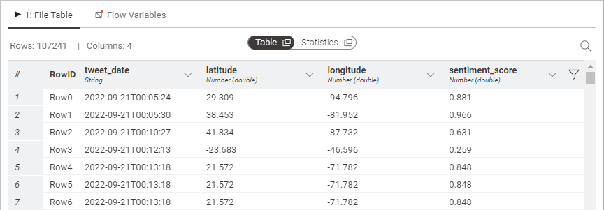
In this workflow, we are using an already prepared dataset that contains a list of tweets from all over the world that contain the keyword “Hurricane Ian”, tweeted between September 1, 2022 and October 5, 2022.The tweets are saved in a .csv file which contains the following information:
- tweet_date: The timestamp when the tweet was posted
- latitude and longitude: The geographic coordinates from where the tweet was posted
- sentiment_score: The sentiment value of the respective tweet, ranging from 0 to 1, indicating whether a tweet is interpreted as negative (0) or positive (1)
To read the ian_tweets.csv dataset we use a CSV Reader node.
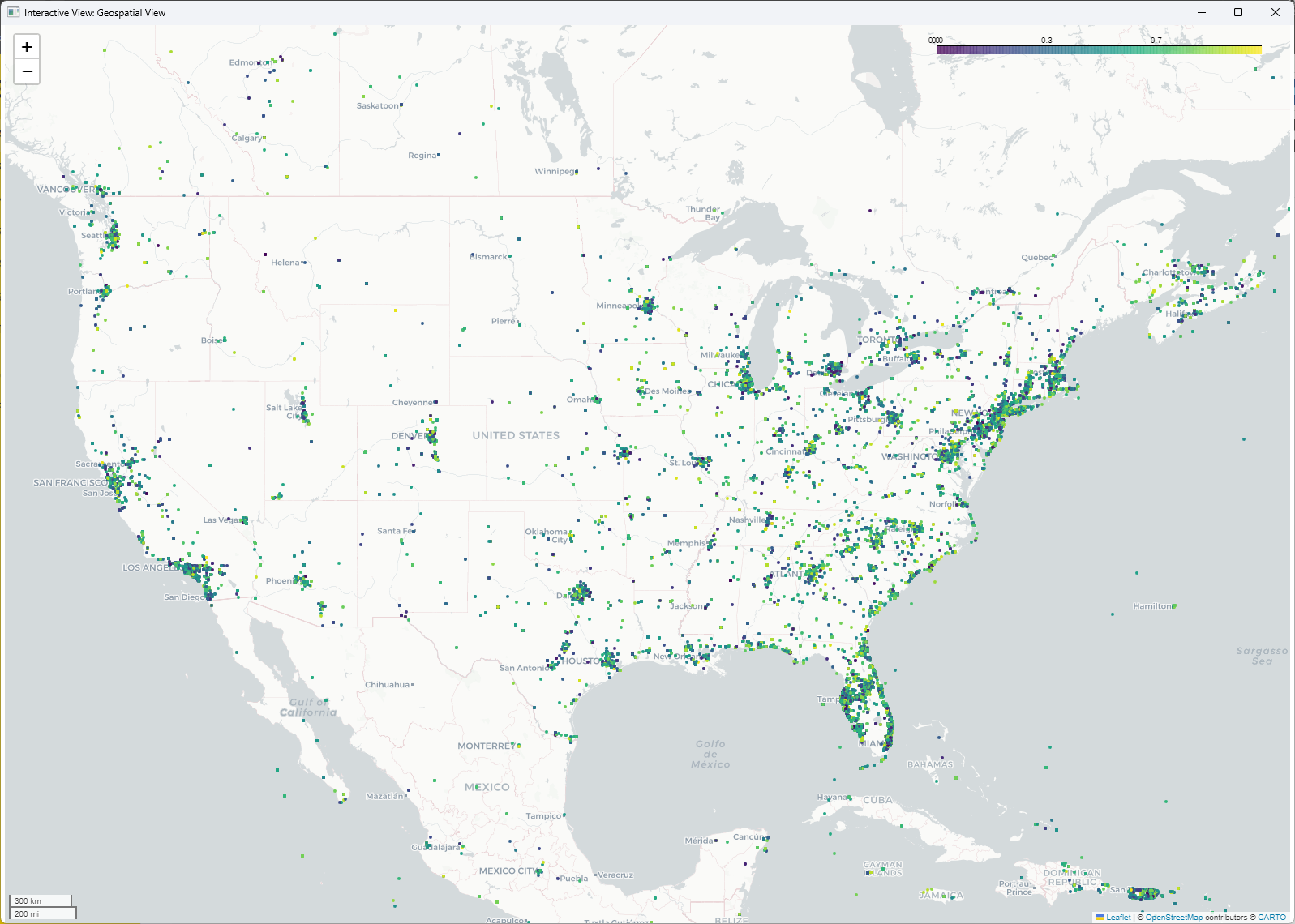
From the tweets’ coordinates contained in the dataset, we can derive the geometric points using the Lat/Lon to Geometry node. The node takes the provided coordinates and appends the geospatial point objects as a geometry column to the table. We can then use the Geospatial View node to visualize the points. In the configuration window of the node, we set the sentiment_score column as the marker color column, with dark purple being negative tweets and yellow being positive tweets. You can see the result of this visualization below.
3. Preprocess GIS data to get hurricane’s impact zones
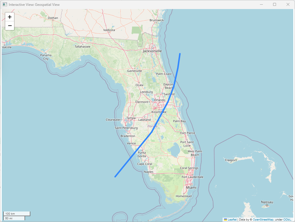
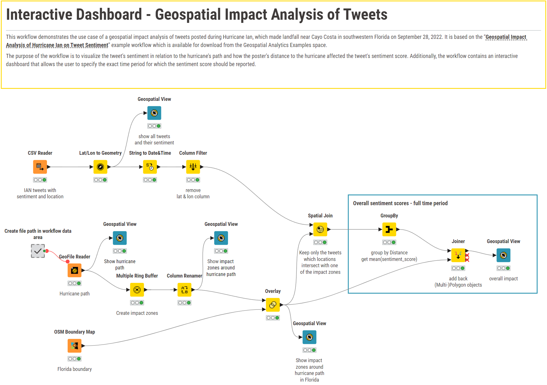
Now, to figure out the impact zones of the hurricane, we first had to read the hurricane’s path into KNIME Analytics Platform which is stored in the ianflorida.shp file. Such a Shapefile (.shp) is a commonly used file format to store vector data. To read shapefiles with KNIME, you can use the GeoFile Reader node, which not only supports (zipped) Shapefiles but also other popular data types such as Geopackage, GeoJSON, or GeoParquet.
The node’s configuration is straightforward as you only need to specify the file’s location in the configuration window of the node.
In this particular shapefile, a spatial LineString object is stored which is a continuous line representing a sequence of coordinates joined together. This LineString shows the path that Hurricane Ian traveled over Florida.
Now, from the hurricane’s path we want to derive the impact zones based on how far the households are located from the hurricane’s path. We want to derive six impact zones, where impact zone 1 is the one closest to the hurricane (high-impact zone) and impact zone 6 the one furthest away (low-impact zone).
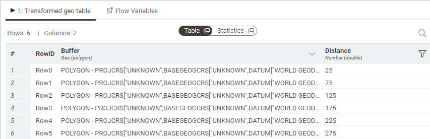
To create the impact zones, we make use of the Multiple Ring Buffer node. The node generates multiple buffer areas, i.e., spatial Polygon objects, around a given geometric object and based on a given distance. It creates one buffer area for each distance defined.
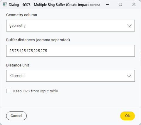
The six impact areas we want to derive have the following distances from Hurricane Ian’s path: 25 km, 75 km, 125 km, 175 km, 225 km, and 275 km (see below). The node then outputs a Buffer column containing the six buffer areas (i.e., polygons), and a Distance column, indicating the impact zone (see below).
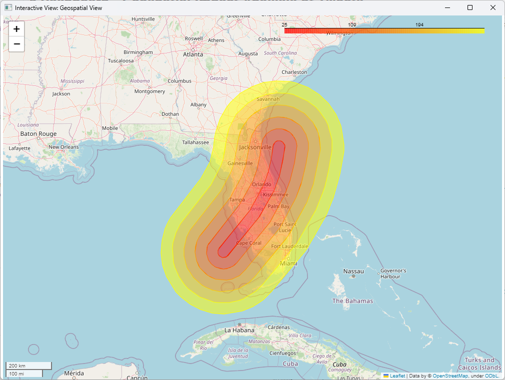
We can now visualize these buffers using another Geospatial View node and using the Distance column as the marker color column. The result is shown below.
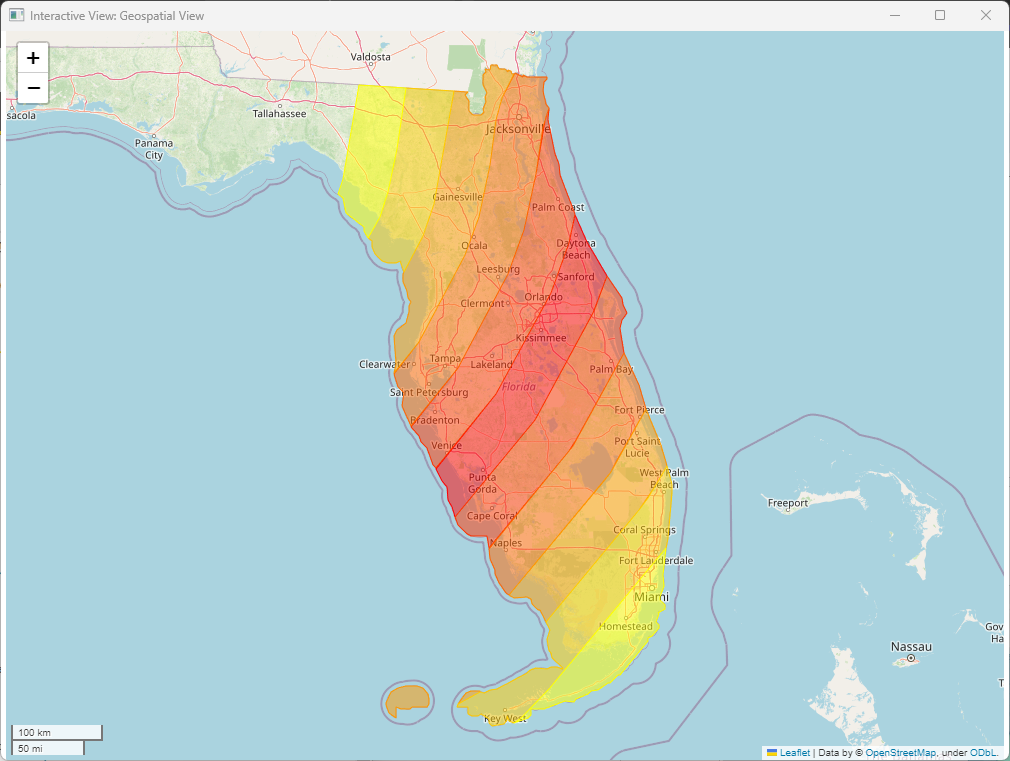
Lastly, to keep only the populated areas of Florida we need to intersect the created buffer objects with the geometric boundary of Florida. To retrieve Florida’s boundary we use the OSM Boundary Map node and define the input place name as “FL, USA”. This node outputs one data row containing a spatial Multipolygon object and some additional geospatial information. For us, the “geometry” column is of main interest.
We now have a data table containing the different impact zones and a data table containing Florida’s geospatial boundaries. Using the Overlay node, we can now create an intersection of the two data tables, resulting in a data table containing the six impact zones, i.e. geospatial Polygons, but only within Florida’s boundaries. The result is visualized below.
4. Visualize the impact of Hurricane Ian on tweet sentiment
Now we know which populated areas in Florida were affected more and which were affected less by Hurricane Ian. But how did this affect the tweets’ sentiment scores? A logical assumption would be that people living in the red zones, i.e., in the high-impact zones, tweeted more negatively about Hurricane Ian than people living in the low-impact zones as damages were expected to be more severe. Let’s find out whether this was the case.
As already described in the section above, the Twitter dataset contains Hurricane Ian tweets from all over the world. However, for this particular use case we are only interested in the tweets posted from within the impact zones. Using the Spatial Join node allows us to merge two tables based on their spatial relationship, resulting in filtering out all tweets from outside the impact zones. After the join, we now have a data table containing all tweet information, including the geospatial Point objects previously derived, as well as the Distance column.
Now, instead of plotting each and every tweet (as geospatial Point objects) resulting in 37000+ points, we will rather derive the mean sentiment value for each impact zone, so that we can plot the impact zones as shown above, but use the mean sentiment score as color marker. To do so, we use the GroupBy node, use the Distance column as the group column and mean(sentiment_score) as the aggregation method. This results in a data table giving one sentiment value for each impact zone (see below).
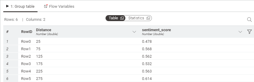
All we have left to do now is add back the (Multi-)Polygon objects from the Overlay node using a simple join operation (Joiner node). Finally, plotting the results, using the mean sentiment_score as color indicator leads to the following plot:
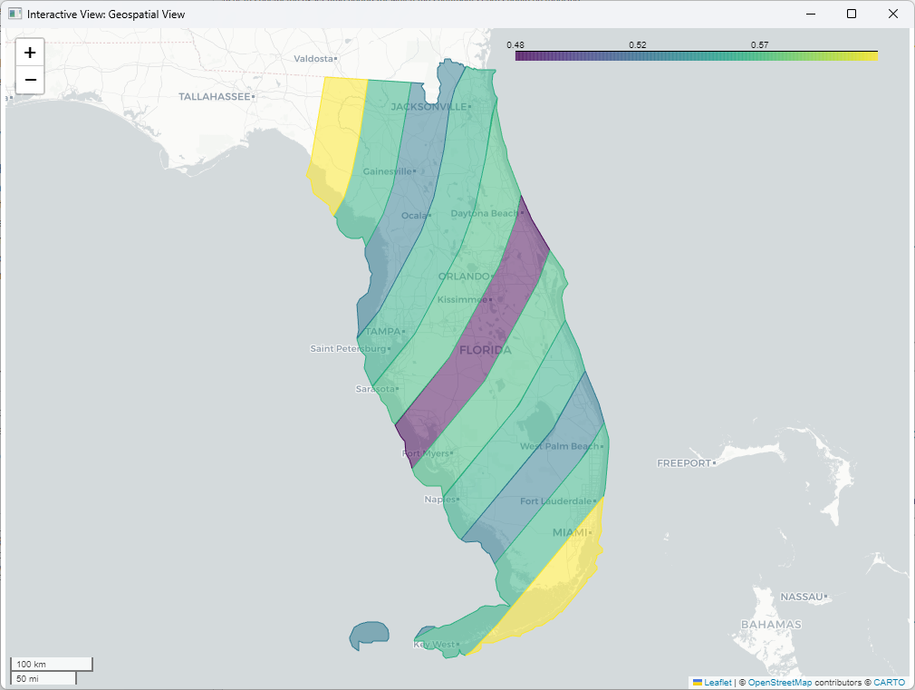
Unsurprisingly, the overall sentiment of people living within impact zone 1 (within 25 km from the hurricane’s path) is the lowest, whereas the sentiment of the people living in impact zone 6 (within 275 km from the hurricane’s path) is the highest. Interesting is, however, that people living in impact zone 2 (within 75 km from the hurricane’s path) overall seem to be less negative about the hurricane than people living further away (impact zone 4).
See the final workflow in the screenshot below.
Note that the sentiment scores represented are the overall sentiment scores over the entire time period. However, it is likely that people’s sentiment changes during the course of the hurricane. It might be slightly more positive before the hurricane makes landfall and might change once it hits Florida - or the other way around if the expected damages were less, for example.
5. Build an interactive dashboard for impact analysis
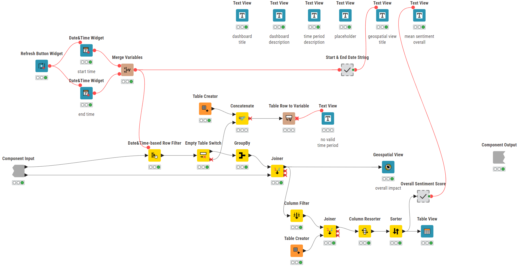
To better account for the timing and to get deeper insights, we’ve extended this workflow by creating an interactive dashboard that allows the user to specify the exact time period for which the sentiment score should be reported. That way, it is possible to compare how sentiment changed over time. For example, how was the sentiment before Hurricane Ian made landfall, and how was it within 24 hours after it made landfall?
For that, we’ve created an interactive dashboard as shown below.
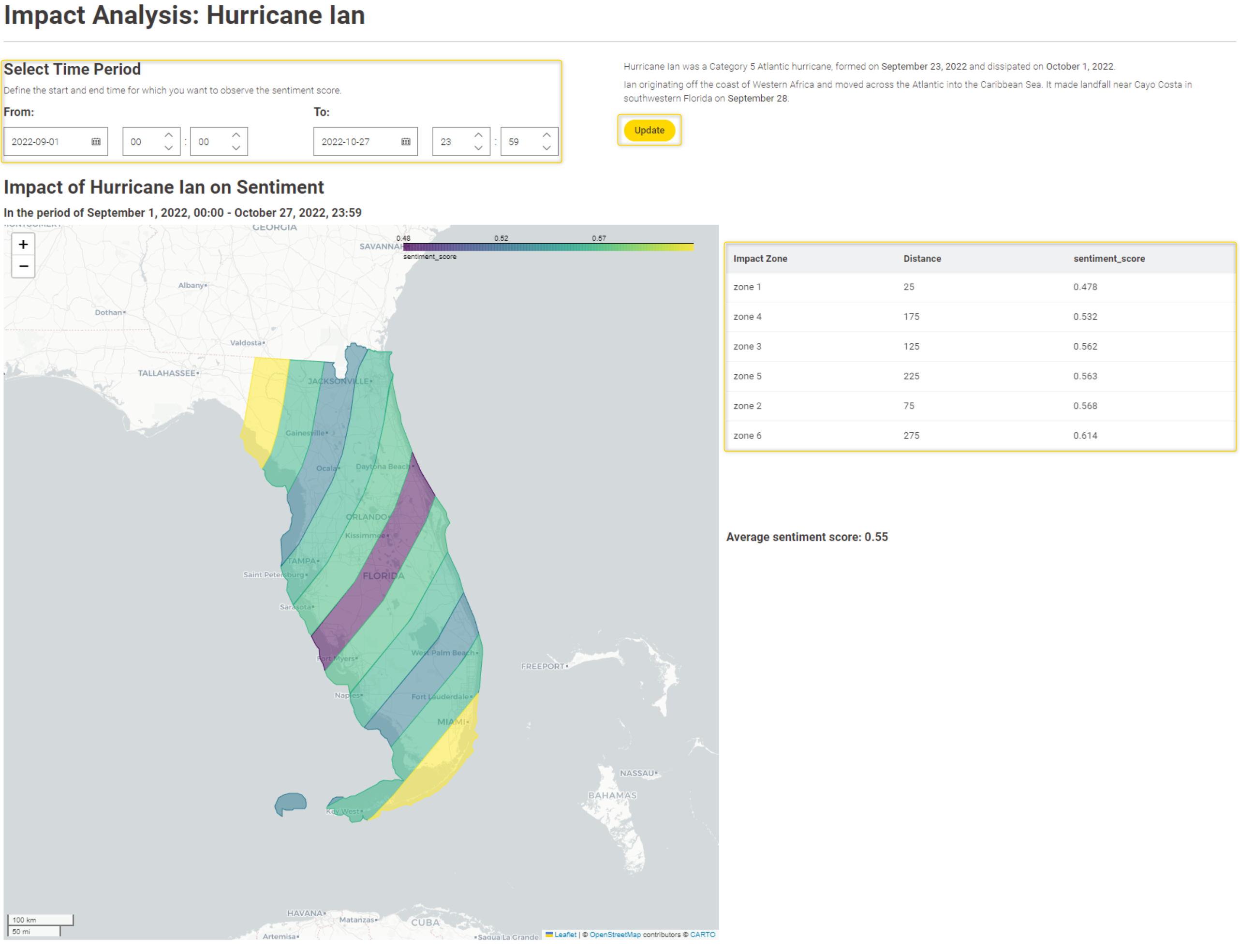
By adding two Date&Time Widget nodes it allows the end user to define their own time period of interest. The Refresh Button Widget node allows for immediate re-execution (“Update” button) so that the geospatial view updates on demand. Lastly, the Table View node on the right displays the impact zone in ascending order to their sentiment value. See the “Interactive Dashboard” component in the screenshot below.
Compare geospatial plots to see how Hurricane Ian affected sentiment
By comparing the geospatial plots for different time periods we can derive some meaningful insights. Overall, the tweets’ sentiment posted by people living closer to Hurricane Ian’s path is more negative than the sentiment of people living further away (see Figure 10).
Up until Hurricane Ian made landfall, so in the time period up until Sep 27, the most negative tweets were posted by people in impact zone 1, whereas the rest of the households were more on the positive side (sentiment_score > 0.5).
However, sentiment changed when Hurricane Ian made landfall on September 28. In the period of Sep 28 onwards, impact zone 1 and 4 became the areas with the most negative tweets (sentiment_score < 0.5). What’s surprising is that people within impact zone 2 and 3 posted more positive tweets. This might be due to the impacts of Hurricane Ian being less than expected in those zones, hence the positive sentiment.
Considering sentiment scores only for within 24 hours after Hurricane Ian made landfall (Sep 28, 3:05 PM - Sep 29, 3:05PM), it shows that especially households within impact zone 5 and 6 posted most negatively, although each zone’s sentiment score was slightly on the positive side (sentiment_score > 0.5).
Of course, you can now go ahead and observe changes in sentiment for different time periods and bring them into perspective with other measures, for example, setting the scores in relation to the total number of tweets posted. The options are (almost) endless.
Download this workflow for free from the KNIME Community Hub.
Explore more resources for geospatial analysis with KNIME
- Get started with: KNIME for Geospatial Analysis
- Explore workflow blueprints for: Geospatial Analytics on KNIME Community Hub
- Watch a webinar: Geospatial Analytics for All