Practically everyone has heard of Little Red Riding Hood, a fairy tale of an encounter between a young girl and the Big Bad Wolf. One of the most popular versions of this tale was written by the Brothers Grimm. But what has a simple folk tale got to do with text stream visualization? And what is stream visualization?
Stacked area charts, or stream visualizations, are very useful to show how topics in a single, or set of, documents change and develop over time. Each document is assigned to a single point in time, for example the publication date, and then specific topics or keywords can be visualized “stacked” on top of each other based on their frequency. A single chart is usually based on multiple documents.
So what do you think about reading the story of Little Red Riding Hood through a stream visualization? Taking the main characters of the story as our keywords, the visualization would show whenever the characters occur and co-occur, revealing their respective importance. This would give an idea of the course of the story without actually reading it!
The reason Little Red Riding Hood is good as an example is because it has a fairly simple storyline with only 5 main characters: Little Red Riding Hood, her mother, her grandmother, the Big Bad Wolf, and a Hunter.
Visualizing the Story
To jog your memories: the story starts with a little girl called Little Red Riding Hood, who is told by her mother to visit her sick grandmother who lives out in the woods. On her way there, she encounters a wolf. The wolf tricks her to stop and pick some flowers before going to her grandmother’s house. While Little Red Riding Hood is picking flowers, the wolf goes to grandmother’s house and eats her, swallowing her in one gulp. Then he disguises himself as the grandmother and waits for Little Red Riding Hood to arrive. He manages to deceive the little girl and eats her too, falling asleep afterwards. Thankfully a hunter passes by and finds the wolf. He opens the sleeping wolf's stomach with a knife. Both the grandmother and the girl get out and help the hunter fill the wolf’s stomach with heavy stones. He dies!
Time passes and when Little Red Riding Hood comes to visit her grandmother again, she meets another wicked wolf who is also planning to eat her. This time she takes care and goes directly to her grandmother’s house. There she and her grandmother devise a plan together and kill the wolf. And they all (except for the wolves) lived happily ever after.
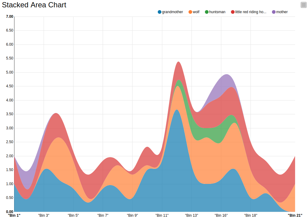
In Figure 1 you can see our visualization of the characters’ occurrences in the story along the story’s timeline. We defined the story’s timeline by splitting the story into chronologically sorted bins, where each bin contains a number of sentences. Each bin represents a discrete step in time in the document. For example, the first bin contains the first 4 sentences, the second bin contains the next 4 sentences, and so on until the last sentence. These bins are shown along the X-axis that represents the progress or timeline of the story. The Y-axis is the frequency of the characters, i.e how many times each character is mentioned in each bin.
In the chart, each character is depicted by a color. The grandmother is blue, the wolf is orange, the huntsman is green, the little red riding hood is red, and the mother is purple.
Figure 1. Text Stream Visualization of Little Red Riding Hood with 4 sentences per bin. The climax of the story is around Bin 16 and 17, which is when the hunter appears and saves Little Red Riding Hood and the grandmother.

The chart shows, for example, that the mother is only mentioned at the beginning and once more towards the end. In contrast, the grandmother, Little Red Riding Hood and the wolf are frequently mentioned together and have a high correlation with each other across the whole timeline. The spikes correlate with where the story picks up and important events take place. For example, around bin 3 to bin 5 there is a spike in the streams for the grandmother, Red Riding Hood and the wolf. In the story, this is when Little Red Riding Hood met the wolf for the first time and they talk about her grandmother. Another spike occurs at around bin 12, which coincides with one of the climaxes of the story where the wolf disguises himself as the grandmother and eats Little Red Riding Hood. The visualization indicates that the story picks up again around bin 16 to 17, which is when the hunter appears and saves Little Red Riding Hood and the grandmother. This is also the only part where the huntsman is mentioned in the story. Afterwards the story gradually comes to its conclusion, reflected in the chart by the decreasing mentions of all characters. The sudden spike right at the end follows the second part of the story where Little Red Riding Hood encounters another wolf and later kills him.
The Workflow
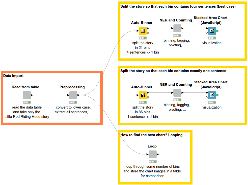
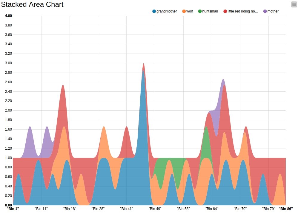
Figure 2 shows the overview of the workflow. First, the Little Red Riding Hood story is read from a data table. We applied some preprocessing steps involving conversion to lowercase and sentence extraction. Next, the Auto-Binner node is used to divide the story into bins. The number of sentences that are placed in one bin varies depending on the story and can be changed by the users. In the workflow you can see two examples: one splits the story into 86 bins where each bin contains 1 sentence; the second example splits the story into 21 bins where each bin contains 4 sentences. In Figure 1 you can see the chart that is based on 21 bins, and Figure 3 below shows the chart based on 86 bins.
Figure 2. Workflow Overview. In the top most branch four sentences are used per bin. The middle branch shows the visualization with one sentence per bin. In the bottom branch a loop has been executed from one sentence per bin, two sentences, etc. up to only three bins in total. Based on the different loop-visualization results, we can identify the best sentences-per-bin setting.

Figure 3. Text Stream Visualization of Little Red Riding Hood with one sentence per bin. Co-occurrences of characters can hardly be seen, compared to Figure 1. One sentence per bin is usually too fine-grained, resulting in high frequency fluctuations from bin to bin.

Once the sentences were divided evenly into bins, we used the GroupBy node to concatenate all the sentences in each bin and convert them into documents, giving us one document for each bin. Now it’s time to tag the main characters and count their occurences, using the Dictionary Tagger node, and create a bag of words and calculate the term frequencies, using the TF node.
At this point, we already have all the data that we need - the absolute frequencies of each character in each bin - but they are not yet in the right format. We want the character names to be the column names and the rows to contain the frequency values in each bin. We used the Pivoting node for this. The whole process is shown in Figure 4. Now that the data processing is finished, the Stacked Area Chart node can be applied to visualize the text stream.
Figure 4. Binning, filtering, and frequency calculation of the extracted character names.

Determining how many sentences are useful in one bin depends on the story and can vary from document to document. In the case of Little Red Riding Hood, which has 86 sentences in total, we found that 4 sentences in each bin results in a visualization that explains the story well. Looping over different setups is useful to find which value offers the best visualization.
Conclusion
To sum up, the stream visualization can not only be applied to a set of documents but also to a single document to visualize its progress. It is a handy way of finding out in which part of the document which topics are covered, or which characters are mentioned, without having to read the text.
