
This is part of a series of articles to show you solutions to common finance tasks related to financial planning, accounting, tax calculations, and auditing, all implemented with the low-code KNIME Analytics Platform.
Sales tax is a statutory requirement and analyzing sales tax liability accurately is important for all organizations. Ever-changing local tax rules add to the complexity and put organizations at risk of a tax audit, which can lead to back taxes and penalties.
Many sales tax reporting processes are repetitive and quickly become labor-intense if teams have to perform them all manually.
Automating sales tax calculations, analysis and reporting can help finance teams quickly reconcile and verify the sales tax they pay in a given year. There are proprietary tax software tools in the market that can be used to automate these tax calculations, however, these “black box” solutions may not provide the clarity and audit trail required to explain tax calculations in case of an audit.
In this article we’d like to show how you can use KNIME to automate sales tax calculations and provide you with an in-built audit trail. The intuitive drag-and-drop nature of KNIME Analytics Platform makes it simple to adjust the solution to incorporate new local tax rules as necessary. See an overview of the solution in the Sales Tax Reporting video.
The task: Automate sales tax reporting
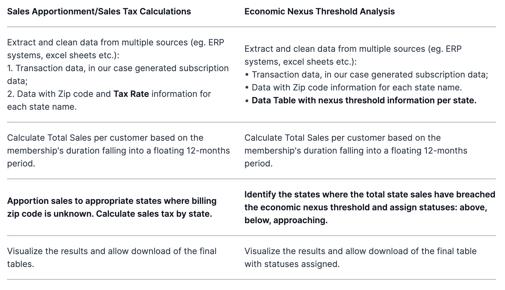
We’re going to demonstrate two different aspects of sales tax reporting based on the example of a company that sells subscriptions. The two types of sales tax reporting are::
- Apportionment of sales and sales tax calculations: Total sales are calculated by multiplying the usage duration within the taxation period by the subscription fee. For accurate sales tax calculations though, we need to make sure that all the sales where the billing zip code is unknown get apportioned to the appropriate states.
- Economic nexus threshold analysis: Economic nexus requires sellers to collect sales tax in states where the seller’s sales exceed the state’s monetary threshold. We will demonstrate how we can create an application that informs an organization about the states where it needs to collect and remit sales tax.
We’ll also walk through a calculator we built for this task. It calculates the duration of an event/subscription in frames of a floating 12-month period. This calculator is available as a so-called shared component for you to plug into your own solutions.
The sales tax reporting process for each type is essentially the same. Below, we’ve highlighted the differences in bold.
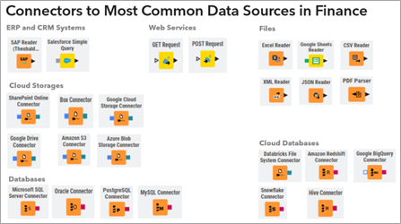
The billing data can be pulled using any of the KNIME connectors. Collect data from ERP systems such as SAP using the SAP Reader node, out of Odoo using the GET Request node, out of a database using the DB nodes, or simply out of an Excel file using the Excel Reader node. For the purposes of this article, we’ve built a workflow that takes data from an Excel file. This is so that you can download the workflow and try it out immediately.
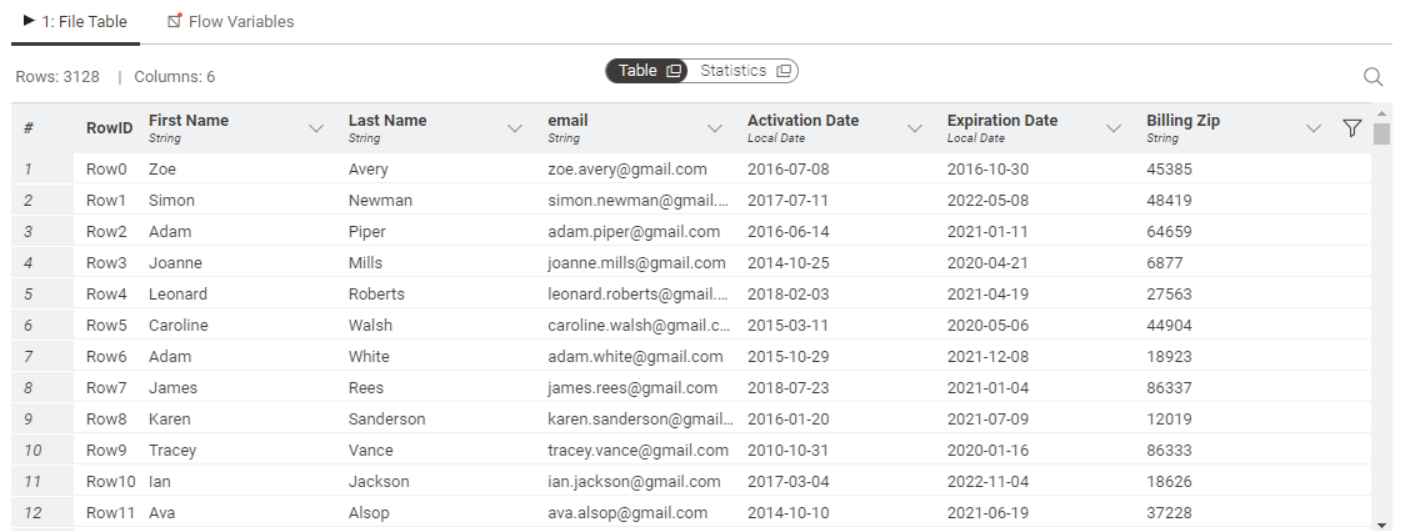
In order to make this example work on everybody’s laptop, without the need of accounts and credentials, we used sample Excel files as our source data for:
- Subscriber billing information with, in this case, Expiration and Activate Dates of the contract (generated):
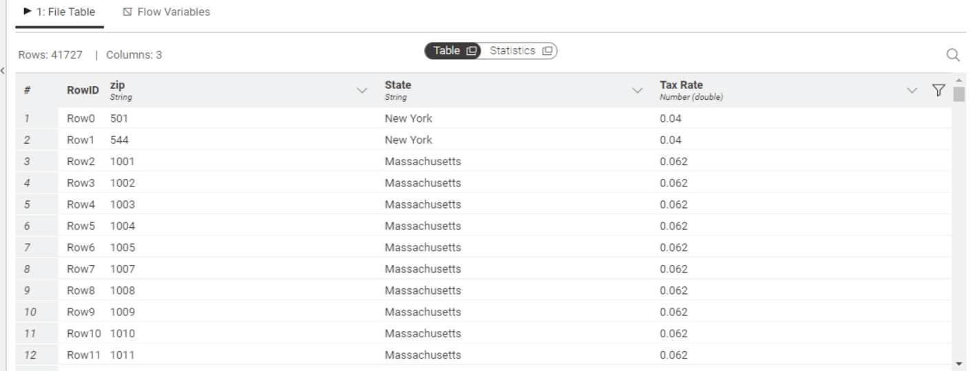
- Reference data to map billing zip code to state names and tax rates. (The sources used for assembling the table can be found here on opendatasoft and tax foundation.)

The workflows: Sales tax reporting
The workflows for Sales Tax Reporting are available and free to download from the KNIME Community Hub.
Let’s walk through the workflows for both use cases and then we will show you how to turn a workflow into a data app.
Sales Apportionment – Static Workflow
You can download the Sales Apportionment – Static workflow here. It consists of three main parts, with each part handled by a workflow collected into components, which you can see below.
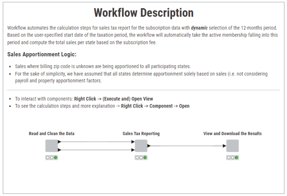
The components take care of the following tasks:
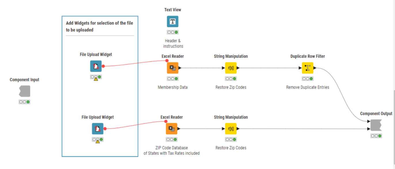
- Read and clean the data, described above.
- Calculate sales taxes per state with apportionment of sales where billing zip code is unknown for the taxation period specified by a user, and have a first visual check with pie charts.
- Sort states by its tax liability and prepare the resulting tables to view and download the results.
Let’s look in more detail in how the sales tax reporting is actually performed in case of unknown sales in the data, i.e. how we apportion them to appropriate states. By holding CTRL + double clicking the component “Sales Tax Reporting” we see the following:
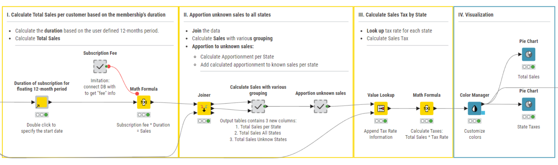
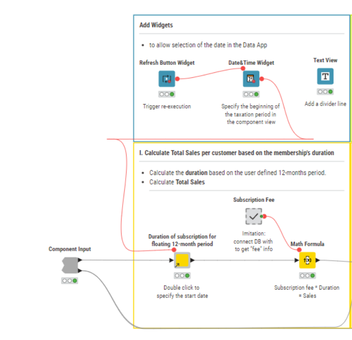
First, we calculate total sales per customer based on the membership’s duration. For that:
Use the component to automatically calculate the duration of any active event/subscription (with Activation and Expiration dates' information provided) in frames of a floating 12-month period. This is useful for yearly reports, when one needs, for instance, to calculate the duration of the active subscription falling into the reporting period.
Note: To recap what components are and how they encapsulate functionality check out this video.
All you have to do is specify the start date of the 12-month period and the component automatically determines the end of the period (+12 month) and calculates the duration of each contract/event/subscription which was active in this selected period, considering also the point in time of activation and expiration dates.
Next, the Math Formula node calculates the sales for each customer by multiplying the duration of his/her active subscription by the subscription fee. The latter is a fixed number here just for simplified reasons but you can prompt the user to specify it by using widget or configuration nodes, or connect to any source with this information - depending on your specific situation/set-up.
Now we want to apportion sales with unknow billing zip to all states:
We use the Joiner node to blend the subscriber information with the state name and tax rate using the billing zip code as the matching column.
In the “Calculate Sales with various grouping” metanode, we use the Group By node to calculate three totals:
- Total Sales per state;
- Total Sales for all states;
- and Total Unknown Sales.
Note. Metanodes are different from Components. Components really are KNIME nodes that you create which bundle functionality, have their own configuration dialog and their own composite views. Metanodes on the other hand are containers of a part of your workflow, that help to build cleaner and structured nested workflows.
Once the above totals are calculated, we move to the metanode “Apportion unknown sales”, which essentially consists of 2 Math Formula nodes:
The first calculates the total unknown sales to be apportioned to a state using the formula:
Total Unknown Sales to be apportioned to a state = (Total Sales per State/Total Sales)*Total Sales Unknown
The second adds the apportioned unknown sales to the known sales for the state to calculate the total sales per state.
Now let’s calculate sales tax for each state. For that we look the state-specific tax rate up with the Value Lookup node and multiply total sales by it for each state with the Math Formula node.
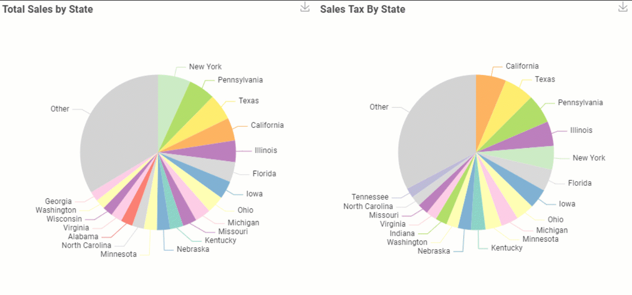
We want to visualize the Total Sales and Sales Tax by State with the Pie Chart nodes.
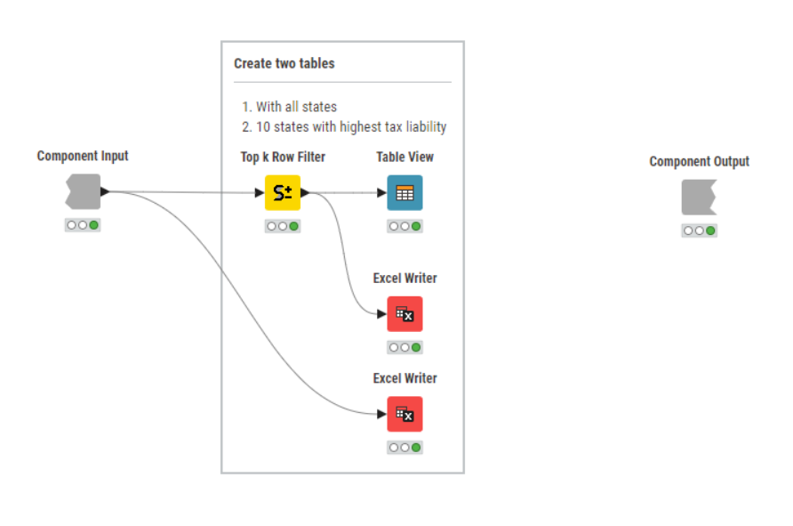
Finally, we want to prepare the resulting tables for download.
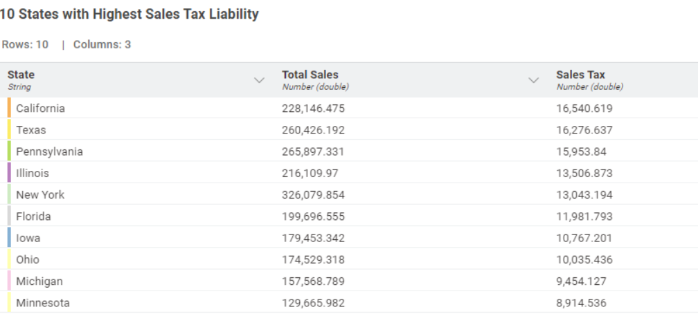
We do that with the View and Download Results component, where we display the table in the composite view with the Table View node and save two output data tables with Excel Writer nodes: one of each contains only 10 states sorted by the highest tax liability with the Top K Row Filter node.
Here we have it, taxes were calculated with apportionment of the sales with unknown billing zip.
Now, let us move to the second use case, where we want to show you how one could analyze the economic nexus threshold with KNIME.
Nexus Threshold – Static Workflow
You can download the Nexus Threshold – Static workflow here. In this case the membership data has no sales with missing billing zip. Hence, no apportionment is required.
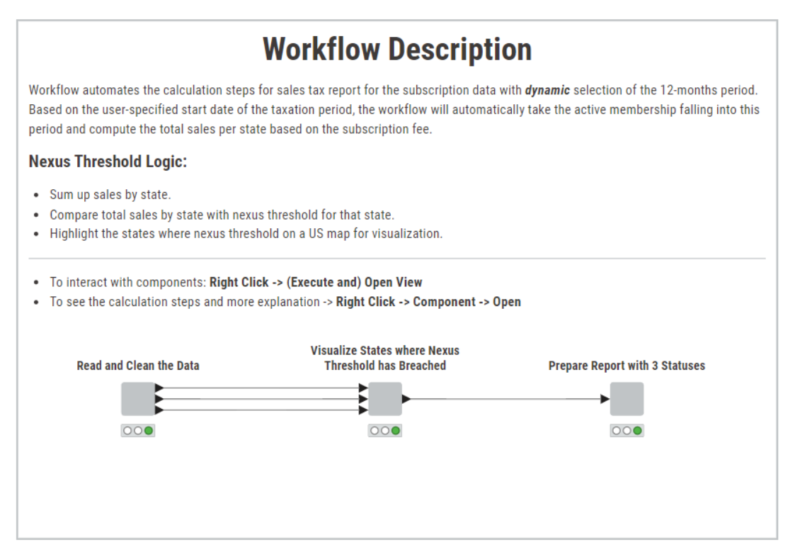
You see one extra output port for the “Read and Clean Data” component - this is the 3d table we mentioned with nexus threshold information for each state.
Let’s look in more detail about how we analyze the nexus threshold situation for each state within “Visualize States where Nexus Threshold has Breached” component.
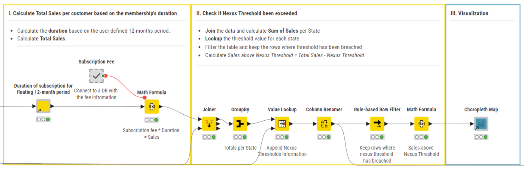
The first step is identical to the previous workflow.
In the second step, we want to look into the threshold analysis.
We calculate total sales per state, add to the table the state-specific economic nexus threshold values and filter the data by keeping only the rows, in this case States, for which the nexus threshold has been breached.
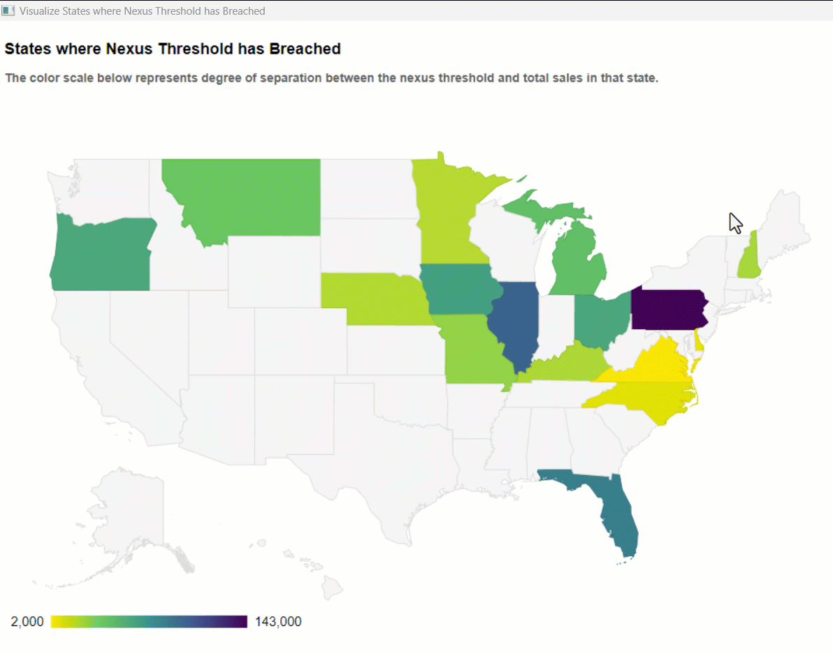
Additionally, we calculate the difference between the total sales and threshold value and display those with the Choropleth Map component.
It creates a choropleth map that colors states for which threshold breached. The color scheme is created by using the numerical values from the column we calculated one step before - the difference between the total sales and threshold value, per state.
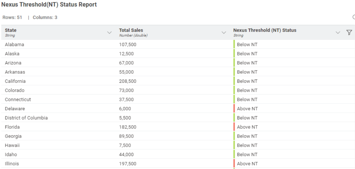
Now let’s have a look at the component “Prepare Report with 2 Statuses”. Here the Rule Engine node assigns one of the three nexus threshold (NT) related statuses to each state:
- Above NT means that the nexus threshold for that state has been breached.
- Approaching NT means within 10000 $ from reaching the nexus threshold for the selected state.
- Below NT means total sales for that state are more than 10000 $ below the nexus threshold.
The Color Manager node assigns red, yellow and green colors, respectively which are added to the table.
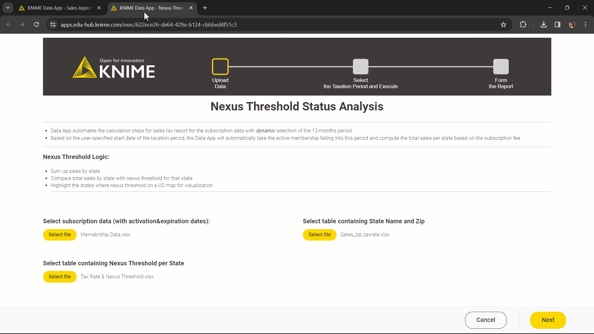
Share sales tax workflows as interactive, browser-based data apps
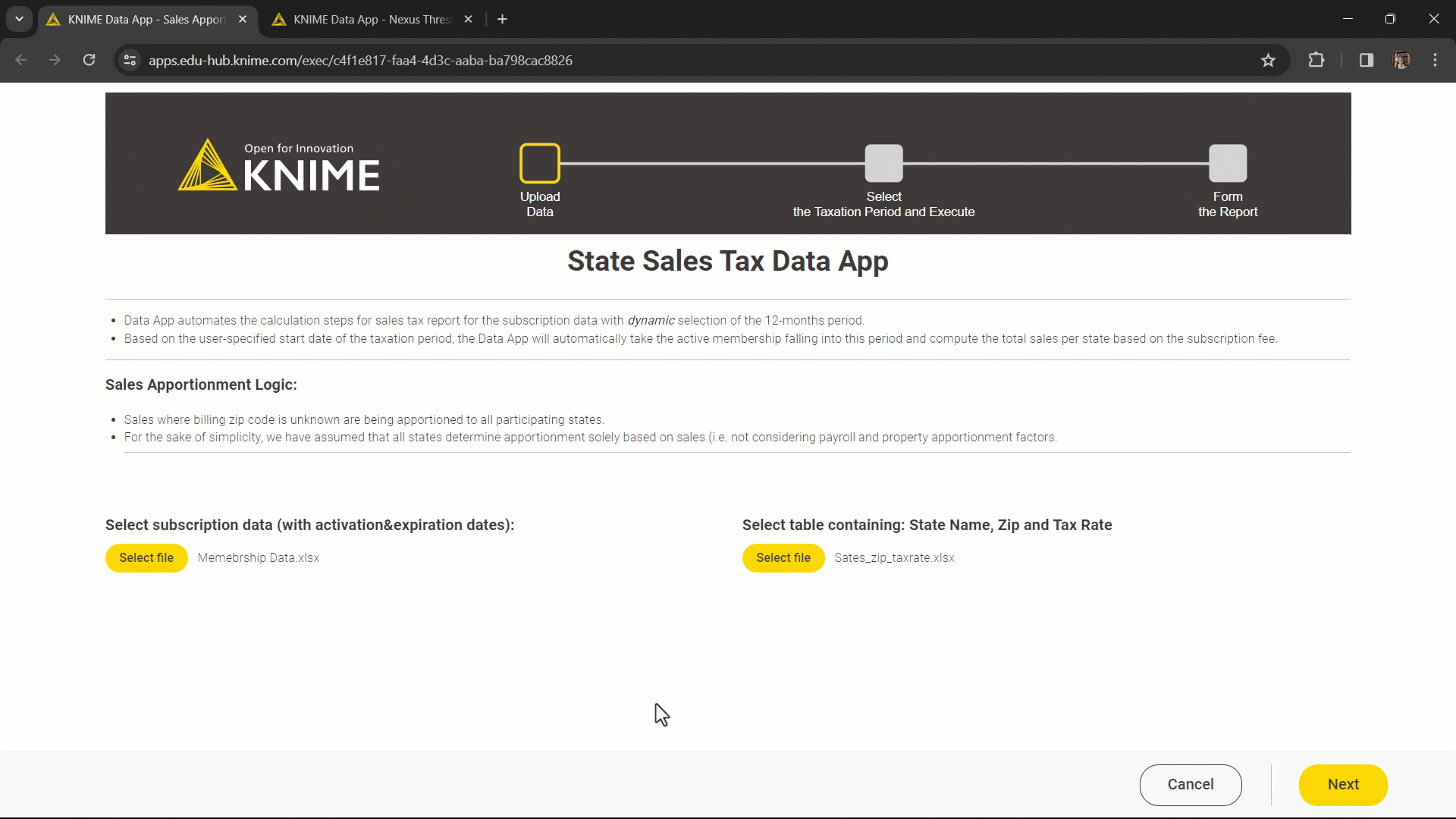
A data app is a web application that lets the user access the sales tax reporting workflows through a simple user interface.
Each of the 3 components in each workflow represents a web page in our data app. What is missing is interactivity in each of the components.
We want to enable the user to select the file they want to upload, select the taxation period, and download the report. We’ll use Widget nodes:
- To enable the user to select the file they want to upload we have to make adjustments to both workflows In the Read and Clean the Data component. We add the Text View node to display the instructions in the interactive view. The File Upload Widget nodes enables the user of the Data
- To allow the user to select the start of the taxation period, we have to adjust both workflows in the second component. We add the Date&Time Widget node, which creates a flow variable with the selected date. This is then used to overwrite the configuration settings of the shared component used to calculate the duration of an active subscription in this newly defined 12-months period.
- To enable the user to download the final report, we add the File Download Widget nodes.
We give our data app a final touch by adding a flowchart header. This is handled by the Data App Flowchart component.
The data app workflows are available and free to download from the KNIME Community Hub:
These workflows have the same structure as their static versions. However, here, we control the beginning of the sales tax period from the interactive dashboard which changes the 12-months period for consideration for the tax reporting; add instructions and the flowchart; and allow more interactivity with file upload and download.
The Results: Deploy your data app to KNIME Business Hub
Now, let’s deploy these two data apps on KNIME Business Hub and see how they will look for an end user. (Note: Learn how to deploy a data app to KNIME Business Hub in this video.)
You can see screencasts below: the first shows the Sales Apportionment data app and the second shows the Nexus Threshold data app. The flow chart above which we created tracks your progress of using the data app. The 3 pages you go in the data app correspond to the three components we built in KNIME Analytics Platform.
3 key benefits of the KNIME solution
- A dynamic data app allows the user to perform operations from a user interface; more plots and charts could also be added to provide an even more robust and comprehensive view of an organization’s sales tax liability and economic nexus status
- You can easily connect to external sources via REST API (GET Request node) or to database (DB nodes) or to specific ERP systems (SAP Reader node) - just change the Excel Reader nodes to the dedicated connectors.
- If your input data changes, the taxation period can be shifted, and the workflow automatically takes care of the calculations correctly without you having to make manual adjustments.
KNIME for Finance
KNIME Analytics Platform is an open-source free low code platform, offering a large variety of data operations. Thanks to its visual and intuitive user interface, implementing solutions does not require any programming expertise. Finance experts can explore the Finance space on KNIME Community Hub for more low-code/no-code examples.
Follow us and send us your ideas for the next finance challenge at blog@knime.com.